
Data analysis involves plotting graphs, and the XY graphs are among the most potent ones. You can use the XY graphs to plot and compare two variables, the trend and how they vary against each other. But what will you do if you have three sets of data to plot on the same graph? This might sound strange, but excel is a hub of multiple possibilities.
A line graph connects different data points, making the trends easy to understand. It also easily represents a change in multiple variables compared to specific variables. A line graph consists of two axes; a horizontal axis or X-axis that shows independent or fixed data and a vertical axis or Y-axis that represents variable data.
In simple terms, a line graph represents quantitative data set visually. The representation can be positive or negative values shown when the line passes through a horizontal axis. Common types of line graphs include:
- Line Graph; which shows trends over time for larger components or data sets.
- Stacked Line Graph; which shows a gradual change in the whole data set over time. In a stacked line graph, the points will not intersect. Instead, there are cumulative points for each row.
- 100% Stacked Line Graph; which shows the proportional contribution to the trends and scales the line so that the total change in variable becomes 100%. This graph makes a straight line at the top.
- Line Graph with Markers; shows the change over time but marks the data points.
- Stacked Line Graph with Markers; which is similar to a stacked line graph, although it marks data points.
- 100% Stacked Line Graph with Markers; which is similar to a 100% stacked line graph, though it indicated data points.
To create any of the above line graphs with three variables, follow these simple steps;
This tutorial will guide you on how to plot three variables on the same graph, so follow the steps below:
How to plot three variables on a line graph
Step 1: Prepare Your Dataset
A dataset can contain daily, weekly, or monthly items. Row headers represent X-axis variables while the column headers represent the Y-axis variables

Step 2: Insert A Line Graph
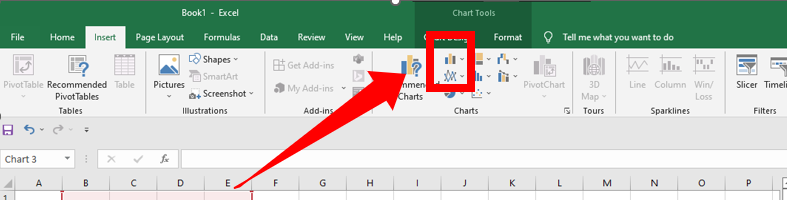
After preparing the data set in three columns, you can insert a line graph following these steps;
1. Select everything, including the headers.
2. Click on the Insert tab on the navigation menu.

3. Navigate to the charts session and click on the line graph

The three axes must have different colors. Your headers are picked automatically to identify the axis.
4. You can choose a line without markers or any other type from the listed options

5. Click on the styles icon on the right-hand side to select different colors, themes, and styles. Alternatively, you can use the styling menu by clicking on chart tools and then design.

Step 3: Switch the Rows or Columns of The Graph
You may need to switch rows in the graph to columns and columns to rows if the data in the columns are shown as rows and vice versa. To perform this, you can:
1. Right-click on the line graph and choose the Select Data option
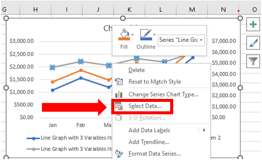
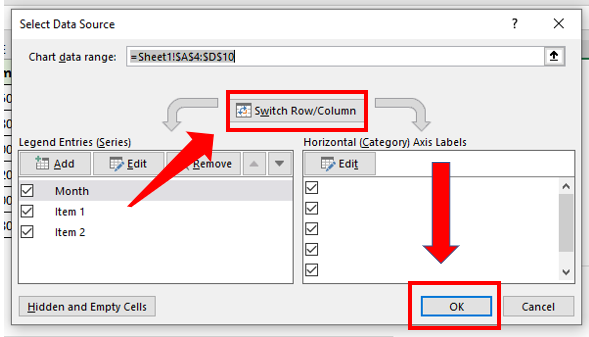
2. Choose the Switch Row/Column option and click OK.
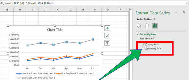
Step 4: Add A Secondary Axis to The Graph
You may also need to add a secondary axis for item 3 to make the line graph more presentable and understandable. To do this, follow these steps:
1. Double-click on the line graph for Item 3, and the Format Data Series pane will appear on the right.

2. Select the Secondary Axis and double-click to change the Maximum value to adjust the data series.
Step 5: Add Chart Elements
Although some elements can be added or removed using Quick Elements, you can edit the graph manually using the Add Chart Element option in excel. Follow these steps to add or remove elements from your line graph.
1. Click on the Add Chart Element to see the list of options
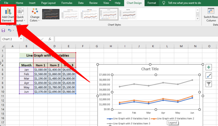
2. You can now remove, edit, or add by clicking on them one by one.
3. You can also find a list of elements by clicking the Plus (+) button on the right corner of the chart.

4. When using this option, mark the elements to add or unmark to remove them
How to graph three variables using a bar graph
Using a visualization design, a bar graph allows you to display comparison data insights. It also shows trends over time and is easy to interpret since it is familiar to many people. A bar graph displays three data variables using vertical or horizontal bars. The size of each bar is proportionally equivalent to the data it represents. Two versions of bar graphs are;
- Horizontal bar charts
- Vertical bar charts.
Although Google Sheets is the most familiar and trusted data visualization tool, sometimes you may want to access a ready-made bar graph that displays all three variables. In that case, you can follow these steps to make a bar chart with three variables based on the type of graph.
Step 1: Using Bar Chart Option to Make a Bar Graph With 3 Variables
1. Select the Cell range B4:E10, go to the Insert tab, choose Charts, and click on Bar Chart.
2. Select any Bar Chart you want.
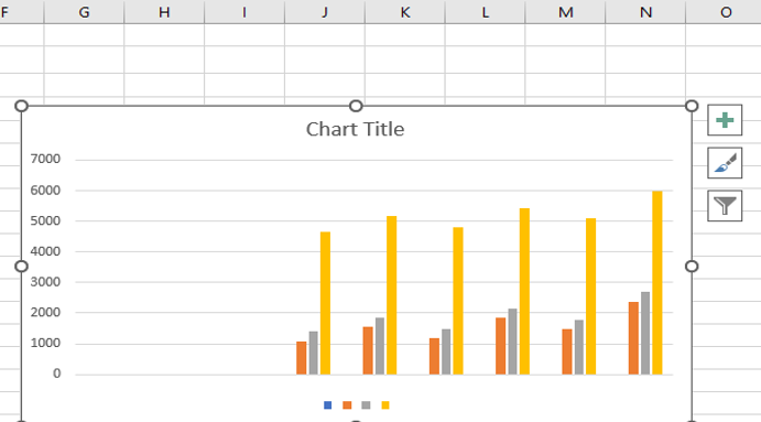
3. Click on the Chart Title to edit it.
4. You can type the title you want, such as Sales Analysis.

5. You will finally have your bar chart with 3 variables
Step 2: Adding the Third Variable on A Bar Graph With 2 Variables
1. Start by selecting the cell range B4:D10, then go to the Insert tab and click on Bar Chart from the Charts.

2. Select any Bar Chart you want from the available options.
3. Click on the Chart Title to edit it.
4. Type in your preferred title, such as Sales Analysis.

5. Right-click on the chart and click on Select Data which opens the Select Data Source
6. Click the Add button, which opens the Edit Series
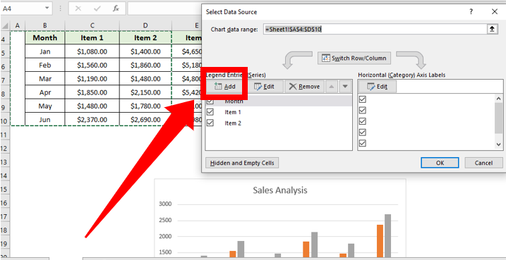
7. Choose Cell E4 in the Series Name
8. Select the Cell range E5:E10 in the Series Values box and finalize by pressing the OK

9. You will see the Profit Data added to the chart data. Press OK and you will finally have your bar graph with three variables.

How to graph three variables using a Bubble Chart
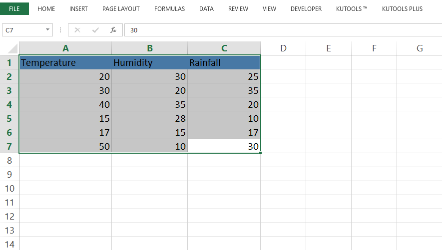
Bubble charts are used to visualize the data in 3 dimensions. Instead of plotting two variables (x and y) in a traditional chart, you will use z coordinates to plot the third variable, showing you its size. So two-variable will be plotted using x and y, and the third will be for size.
1. Temperature and Humidity will be X and Y coordinates, and Rainfall will be Z coordinate
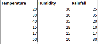
2. Select the table.

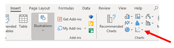
3. Go to Insert > Insert Scatter Chart or Bubble Chart > Bubble
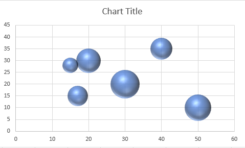
4. Select the 3-D Bubble

5. A 3-D Chart will be Plotted.
That is all there is on how to plot three variables on one graph. I hope you enjoyed this tutorial. Please share!