In today's world, where data is everything, it's critical to ensure that you comprehend and interpret the information comprehensively. It may seem straightforward to work with raw data, but, in reality, it can be incredibly daunting and challenging. This is where data visualization comes into the picture. It allows you to visualize extensive datasets in a more engaging and interactive manner. But with so many visualization tools available in the market, how do you determine which one best suits your needs? Specifically, which tool-out-of-the-two: Excel or Power BI – work wonders for the precise visualizing needs that you have?
Key Takeaways
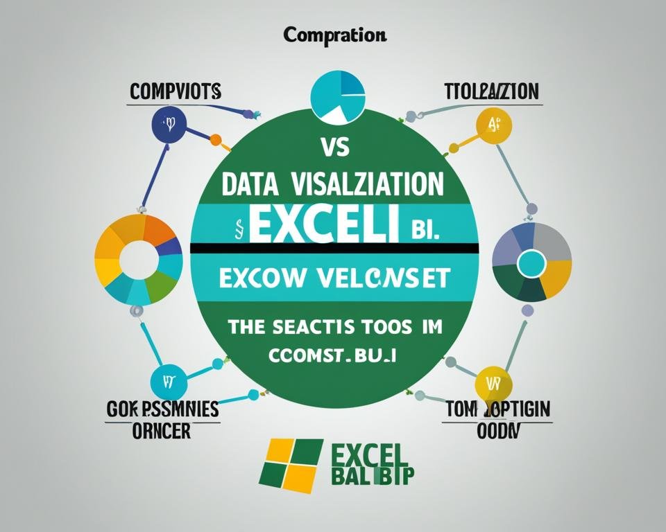
- Excel and Power BI both offer data visualization capabilities
- Power BI is considered more suitable for complex visualizations and working with large datasets
- Excel is a simple and widely used spreadsheet software, and it still works well for small datasets and for simple charts and graphs sets
- Your choice of tool needs to depend on the complexity of your data and your specific analytics needs
- An integrated approach using both Excel and Power BI could leverage both tool capabilities to their full extent
Overview of Data Visualization
Data visualization is a critical tool for analyzing complex datasets. It involves transforming data into graphical representations that can be easily interpreted and understood. By visualizing data, users can identify patterns, spot trends, and draw insights that may be difficult to discern from raw data. Effective data visualization relies on selecting appropriate visualization techniques that best represent the characteristics of the data being analyzed.
Did you know:
- Data visualization has been used for centuries. The first known chart was created by a Scottish engineer named William Playfair in 1786.
- Data visualization has become increasingly important in fields such as business, finance, healthcare, and sports analytics.
- Data visualization tools help users see the big picture by simplifying complex data sets into easy-to-digest visual forms.
Take a look at this example of data visualization:
Table 1: Benefits of Data Visualization
| Advantages | Explanation |
|---|---|
| Clarity | Visuals can provide a clear and concise representation of data, making it easier for users to understand complex information. |
| Engagement | Visuals are more engaging and memorable than written or spoken content, helping users connect with the data more easily. |
| Insight | Data visualization enables users to draw insights and make informed decisions by presenting complex data in an intuitive way. |
As you can see, data visualization is an essential tool for working with large and complex datasets, providing an intuitive way to extract insights and drive better decision-making.
Data Visualization in Excel
Excel is a widely used spreadsheet software that offers basic data visualization capabilities. Users can create various visualizations such as line graphs, bar charts, pie charts, and more, using Excel's built-in tools. However, Excel may not be the best option for complex visualizations that require more advanced features and are suitable for small datasets only.
In this chart, we can see the total number of sales for different products in Q1 and Q2. Although this bar chart is easy to create, it lacks the ability to provide in-depth analysis of the data.
Table 1: Comparison of Data Visualization Features in Excel and Power BI
| Features | Excel | Power BI |
|---|---|---|
| Connect to Data | Basic | Advanced |
| Data Transformation | Basic | Advanced |
| Visualization Types | Basic | Advanced |
| Interactive Visuals | Basic | Advanced |
| Real-time Data Tracking | No | Yes |
Table 1: Comparison of Data Visualization Features in Excel and Power BI
As we can see in Table 1, Excel lacks advanced features for data visualization compared to Power BI. While Excel may be sufficient for simple visualizations and small datasets, Power BI is the preferred tool for more complex and dynamic visualizations.
Introduction to Power BI
Power BI is a powerful business intelligence tool developed by Microsoft. It allows users to connect to various data sources, including Excel spreadsheets, SharePoint lists, and SQL databases, among others. With Power BI, users can easily clean and transform data, and create interactive dashboards and reports with advanced visualization options.
Unlike Excel, Power BI is designed to handle large datasets with ease, making it perfect for enterprise-level organizations or businesses dealing with massive amounts of data. Power BI also offers more flexibility in creating complex visualizations that are interactive and visually appealing.
One of the key features of Power BI is its ability to connect various data sources and create relationships between them. This enables users to easily combine data from different sources into a single dashboard or report, even if the data is stored in different formats.
With its advanced capabilities, Power BI is a preferred tool for many organizations when it comes to data visualization and business intelligence. Let's now take a closer look at some of the fantastic features that make Power BI a handy tool for data visualization.
Power BI Features
| Features | Description |
|---|---|
| Data Modeling | Users can create complex data models with ease, including relationships, hierarchies, and calculated columns. |
| Connectivity | Power BI can easily connect various data sources, including Excel, SQL Server, SharePoint, and cloud-based sources like Azure SQL database and Dynamics 365. |
| Visualizations | Users can create interactive and engaging visualizations using Power BI's vast collection of charts, tables, and custom visuals. There are also various formatting options to customize the look and feel of your visualizations. |
| Collaboration | Power BI offers several collaboration options, such as sharing dashboards and reports with colleagues, creating workspaces, and embedding visuals in different applications. |
| Mobile Access | With Power BI mobile app, users can easily view their dashboards and reports on the go across different devices, including smartphones and tablets. |
The above features make Power BI suitable for a wide range of use cases, from simple data visualizations to complex dashboards and reports. Additionally, Power BI provides a fast and intuitive way to analyze your data and make data-driven decisions.
Key Differences Between Excel and Power BI
Excel and Power BI both provide data visualization capabilities, but there are several notable differences that set them apart. Power BI offers advanced visualization options that Excel may lack, including drill-through, cross-filter, and interactive visuals. With Power BI, users can create more complex and dynamic visualizations that enable them to explore their data in greater detail.
Another key difference between Excel and Power BI is real-time data tracking and updates. Power BI supports automatic data refresh, which means users always have up-to-date visualizations with refreshed data. Excel may require manual data updates, making it less suitable for real-time data analysis.
| Feature | Excel | Power BI |
|---|---|---|
| Basic Visualization | ✓ | ✓ |
| Advanced Visualization | ❌ | ✓ |
| Real-time Data Tracking and Updates | ❌ | ✓ |
As shown in the table above, while both Excel and Power BI provide basic visualization features, Power BI has additional advanced features that allow users to create more complex and dynamic visualizations.
"Power BI is the preferred tool for those who require more advanced visualization options and real-time data tracking."
Data Visualization Best Practices with Excel
If you decide to use Excel for your data visualization needs, there are some best practices you should follow to ensure that your visualizations are clear and effective.
Selecting the Appropriate Chart Type
When creating a visualization in Excel, it's important to select the appropriate chart type for your data. Excel offers a variety of chart options, including bar charts, line graphs, scatterplots, and more. Choose the chart type that best represents your data in a clear and easy-to-understand way.
Using Color Schemes Effectively
Color can be a powerful tool in data visualization, but it's essential to use it effectively. Select a color scheme that is visually appealing and enhances the data without detracting from it. Consider using contrasting colors for emphasis and limiting the number of colors used to avoid overwhelming the viewer.
Organizing and Labeling Your Visualizations
Clear labeling and organization of your visualizations are crucial for effective communication. Use descriptive titles and labels for each component of your visualization and make sure that the information is presented in a logical and easy-to-follow manner.
“Good data visualization is not an end in itself, but rather a step towards better understanding of the data.” –Fernanda B. Viégas
Advanced Data Visualization with Power BI
Power BI provides a variety of visualizations and features that allow users to create dynamic and complex visualizations beyond basic charts and graphs.
Interactive Filters
With Power BI, you can create interactive visuals and implement filters to enable users to explore data in a more meaningful way. Users can filter data by specific categories or values, and the visual will adjust accordingly in real-time.
Custom Visuals
Power BI also offers custom visuals created by the Power BI community. These visuals are extensively tested and offer a wide range of features that might not be available in the default visuals. Furthermore, you can import the visuals into Power BI and start using them in your reports.
Calculated Columns and Measures
You can create calculated columns and measures to enhance your data analysis. Calculated columns enable users to create new columns in their dataset based on existing columns, while measures allow for the creation of calculations based on the data. You can utilize these features to create more dynamic and interactive visualizations.
Integrating Excel and Power BI for Data Visualization
If you already have data stored in Excel, you can take advantage of Power BI's advanced visualization capabilities without having to migrate your data. Simply use Excel as a data source for Power BI. Power BI offers a variety of connectors that allow you to import data from Excel into your Power BI report in just a few clicks. Once the data is in Power BI, you can use its advanced visualization features to create interactive and insightful reports that can be shared across your organization.
If you want to use Power BI's visualizations in your Excel reports, you can import them directly from Power BI. Power BI offers a feature called Power BI Publisher, which allows you to embed Power BI visuals directly into Excel reports. These visuals can be customized to fit the look and feel of your Excel report using Excel's formatting options.
Integrating Excel and Power BI for data visualization provides the best of both worlds and is a great way to achieve flexibility and advanced visualization capabilities. Use Excel to store your data and Power BI to create engaging and interactive reports.
“Integrating Excel and Power BI for data visualization provides the best of both worlds and is a great way to achieve flexibility and advanced visualization capabilities.”
Example Table: Comparison of Excel and Power BI Features
| Feature | Excel | Power BI |
|---|---|---|
| Data Sources | Excel files, CSV, Access, SQL Server, Oracle, and others | Wide range of connectors including Excel, databases, and cloud sources like Azure and AWS |
| Data Capacity | Can handle small to medium datasets up to 100k rows | Can handle large datasets up to millions of rows and can perform real-time analytics |
| Visualization Types | Pie charts, line graphs, bar charts, and others | Interactive visuals, drill-through, cross-filtering, and other advanced visualizations |
| Collaboration | Simple sharing via email or OneDrive, but lacks advanced collaboration features | Collaboration enabled through sharing, commenting, and access controls, with real-time updates and versioning |
As shown in the table above, while Excel has basic visualization capabilities, Power BI offers much more powerful and advanced options. By integrating Excel and Power BI, you can leverage the strengths of both tools and achieve the flexibility and advanced visualization capabilities that meet your specific data analytics needs.
Conclusion
Choosing between Excel and Power BI for data visualization ultimately comes down to your specific needs and the complexity of your data. For simple visualizations and smaller datasets, Excel can be a sufficient option. However, for more advanced and interactive visualizations, Power BI is the preferred tool.
Remember to follow best practices for data visualization, regardless of the tool you choose. This includes selecting appropriate chart types, using color schemes effectively, and organizing and labeling visualizations for clarity and ease of understanding.
Additionally, integrating Excel and Power BI can provide the best of both tools by leveraging their strengths. You can use Excel as a data source for Power BI and import Power BI visualizations into Excel reports for combined flexibility and advanced data visualization capabilities.
Overall, data visualization is an essential component of data analysis and can greatly enhance your ability to make sense of complex information. Whether you choose Excel, Power BI, or a combination of both, ensure that your visualizations accurately represent your data and effectively communicate your insights.
FAQ
What is data visualization?
Data visualization refers to the graphical representation of data to help users make sense of complex information and detect patterns or insights.
What data visualization capabilities does Excel offer?
Excel, a widely used spreadsheet software, offers basic data visualization capabilities. Users can create line graphs, bar charts, pie charts, and other common visualizations using Excel's built-in tools.
Is Excel suitable for complex visualizations?
Excel is more suitable for small datasets and may lack more advanced features required for complex visualizations.
What is Power BI?
Power BI is a powerful business intelligence tool developed by Microsoft. It allows users to connect to different data sources, clean and transform data, and create interactive dashboards and reports with advanced visualization options.
How does Power BI compare to Excel in terms of data visualization capabilities?
Power BI offers more advanced visualization options, such as drill-through, cross-filter, and interactive visuals, which Excel may lack. Power BI also supports real-time data tracking and updates, enabling users to have up-to-date visualizations with refreshed data.
Are there any best practices for data visualization with Excel?
Yes, it is important to follow best practices when visualizing data in Excel. This includes selecting the appropriate chart type, using color schemes effectively, and organizing and labeling visualizations for clarity and ease of understanding.
What advanced data visualization features does Power BI offer?
Power BI offers advanced features such as interactive filters, custom visuals, and the ability to create calculated columns and measures for enhanced data analysis.
Can I integrate Excel and Power BI for data visualization?
Yes, you can leverage the strengths of both tools by integrating them. You can use Excel as a data source for Power BI and import Power BI visualizations into Excel reports, combining the flexibility of Excel with the advanced data visualization capabilities of Power BI.
Which tool should I choose for data visualization, Excel, or Power BI?
It depends on your specific analytics needs and the complexity of your data. For simple visualizations and smaller datasets, Excel can be sufficient. However, for more advanced and interactive visualizations, Power BI is the preferred tool.