Microsoft Excel is one of the most user-friendly and useful data management tools. It is used worldwide by most organizations to record, analyze and interpret data. It offers a lot of features to its users, one of them being graphs. These graphs come in different formats, types, and styles, making it possible to edit them to suit their needs.
Excel graphs are very beneficial and interesting as they help visualize summarized data in an easily understandable way. They are mostly preferred when working with large sets and sheets of data in your Excel worksheet. Not only do they save on time, but they also present a clear picture of the key information to concentrate on.
Let us learn how to graph your Excel data to make your workbook more interesting. Here we go.
Steps to follow when creating Graphs using Excel data
1. On your computer, open the Microsoft Excel program.
2. On the File menu, click on a blank sheet to create a new workbook. If you have data in a saved file, click on the Open option and select the file you want to access.
Select your excel sheet data that you want to graph. Start by clicking on the cell with your first header, hold the shift key, and click on the last header's last cell. In short, make sure you have selected all your data sets, including the headers and data labels. In case you are working with a new worksheet, type in your data in the blank sheet.
3. Highlight the data. On the main menu ribbon, click on the Insert tab to display the tab's toolbar.

4. Under the Charts section, select the graph type you prefer. You can decide to choose a bar graph, line, or pie chart graph.

5. Select the format of the graph to represent your data. You can select 2-D, 3-D, Pyramid, Cone, e. t. c.
6. Start to format your graph. Here you add a graph title or name. Do this by double-clicking on the Chart Title text at the top of the chart. Delete this text and replace it with your preferred name. You can also adjust your data's layout and colors, edit your legend and labels, e. t. c.

7. Save your document. Click on the File menu of your computer, click Save to save any changes made if you were working with an existing Excel file. Click on Save As when the file is new; on the field 'Save as Type,' select the File format. Click on the 'File Name' field and type in the document's name. Select the location to save your file and click 'Save.'
How to graph excel data on a line chart
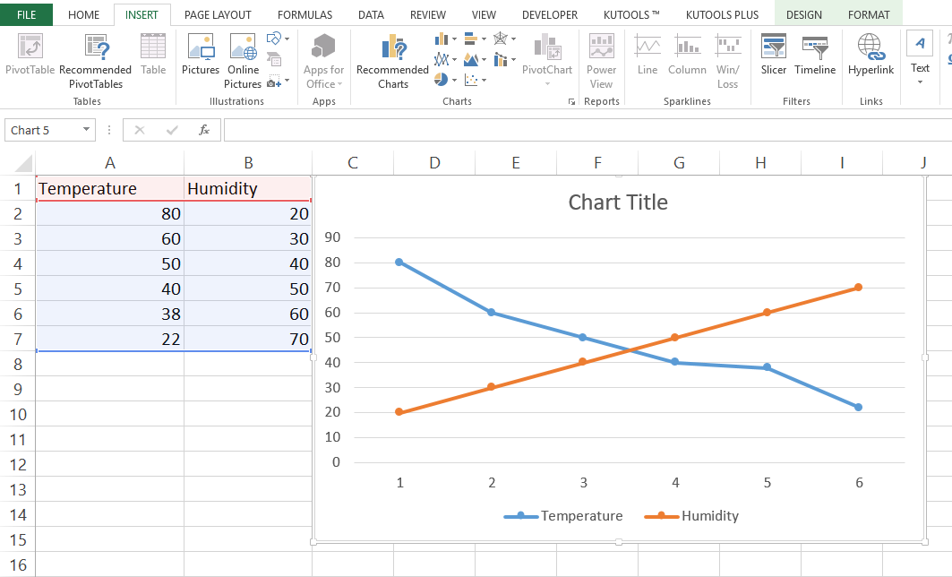
1. Let's assume you want to draw a line graph using the following data

2. Highlight all the data in your table

3. Click on the Insert tab

4. Navigate to charts and select a line graph

Excel will populate a chart automatically based on the data on your table
Conclusion
When thinking about excel graphs, it does not have to be overly complex. The beauty of this feature in excel is that it is automated, and you do not have to stress how to form or draw the graph manually. With the above steps, the process of graphing your data should be pretty easy and manageable.
