
Excel is one of the might tools for creating charts and graphs. Excel applications allow users to visualize and create a chart from the selected dataset. There are numerous Excel graphs that users use to visualize the dataset. The Waterfall is one of the in-builts graphs that are present in Excel. This type of graph is commonly used where the dataset comprises positive and negative numbers. This article will discuss common ways of creating a waterfall chart in your Excel.
Creating waterfall Graph
Here are the steps to follow:
1. Open the Excel application.
2. Open the Workbook that contains the worksheet with your dataset. Add your dataset to the sheets if you’re using a new workbook.
Note: The waterfall graph is suitable where the dataset is a mixture of positive and negative numbers.

3. Highlight the cells with the dataset you wish to convert to a waterfall graph.
4. Then click the Insert tab on the Ribbon. In the Chart section, click the Insert Waterfall Chart drop-down button.

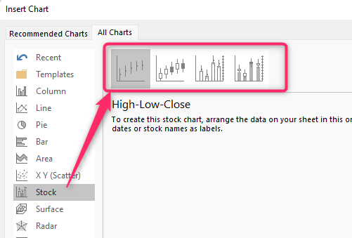
5. Choose one waterfall chart from the list. Alternatively, click the More stock Chart button to open the Insert chart dialogue box.
6. From the box, locate the Recommended chart pane and click on Waterfall or the Stock button. Then, choose the chart format you want to use on the right pane.
7. The selected waterfall graph will be inserted into your Excel screen.

Using Keyboard Shortcuts to insert waterfall graph
Steps:
1. Open the Excel application.
2. Open the Workbook that contains the worksheet with your dataset. Add your dataset to the sheets if you’re using a new workbook.
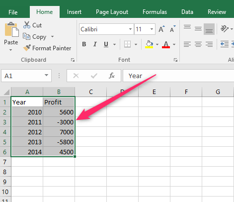
3. Highlight the cells with the dataset you wish to convert to a waterfall graph.
4. Press the Alt + N keys on your keyboard.
5. Press the I + 1 keys to open the Insert waterfall drop-down menu.
6. Choose one waterfall chart from the list. Alternatively, press the M key to open the Insert chart dialogue box.
To customize Waterfall Graph
Steps to follow:
1. Double-click on the Chart Title section to edit and add the new title of your graph. After adding the title, press the Enter key to save changes.
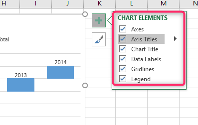
2. Click the chart and locate the Chart Element button(Plus sign).
To add the gridlines to your chart, check the Gridlines checkbox.
To add the legends to your Excel Chart, check the Legend checkbox.
Finally, to add the chart axis, check the Chart Axis checkbox.
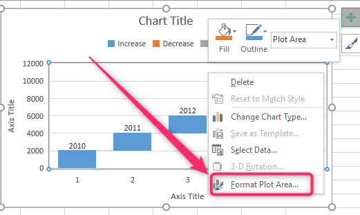
3. Right-click on the chart and select the Format plot Area button. On clicking, A Format plot Area pane will open on the right-hand side of the screen.
4. To change the color fill of the chart, click the Fill & Lines icon. Then, select the filling option you need to apply to your chart.

5. To add effects to your chart, click the Effects icon and choose the Effects you wish to apply to the document.